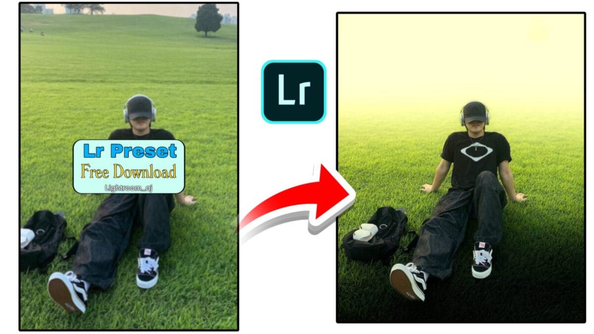
Color Grading Tools
Color grading in Adobe Lightroom is one of the most powerful ways to give your photos a cinematic, stylish, or professional look. Lightroom offers advanced tools such as Color Wheels, HSL, Curves, Color Mixer, and Calibration to control tones, hues, and contrast with precision. This article explains all Lightroom color grading tools and how to use them effectively.
1. Color Grading Wheels (Shadows, Midtones & Highlights)
Lightroom’s Color Grading panel replaces the older Split Toning feature and offers a more advanced grading experience. You can add different colors to shadows, midtones, and highlights individually.
Key Features:
- Shadows Wheel: Adds mood or depth with darker tones
- Midtones Wheel: Controls skin tones & main color of the image
- Highlights Wheel: Adds warmth or coolness to bright areas
- Blending & Balance: Controls how colors merge across tonal ranges
Why It’s Useful:
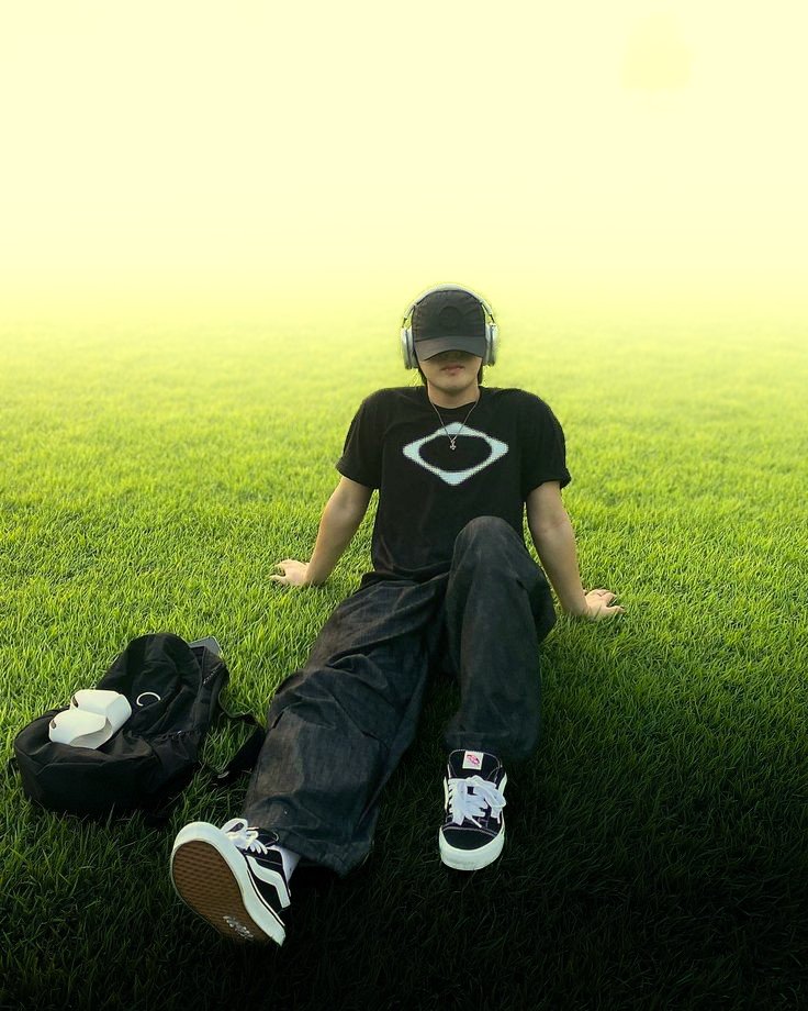
Perfect for cinematic teal & orange effects, dramatic portraits, and stylized edits.
2. Hue, Saturation & Luminance (HSL) / Color Mixer
The HSL / Color Mixer panel is essential for color adjustments. It allows you to change specific color ranges without affecting the entire image.
What Each Slider Does:
- Hue: Changes the shade of a color (green → teal, red → orange)
- Saturation: Controls color intensity
- Luminance: Adjusts brightness of the color
Example Uses:
- Make skies bluer by lowering Blue Luminance
- Enhance skin tones with the Orange Hue slider
- Create cinematic tones by adjusting Green → Teal
3. Tone Curve — The Secret to Professional Color Grading
The Tone Curve panel gives deep control over contrast and color tones. It offers both:
- RGB Curve: General contrast (S-curve for cinematic look)
- Red, Green, Blue Channels: Individual color tinting for highlights and shadows
Popular Curve Techniques:
- Fade Effect: Raise the black point
- Cinematic Teal & Orange: Adjust blue and red channels
- Film Look: Create softer contrast using flattened curve
4. Calibration Panel — The Foundation of Color
The Calibration panel affects the base color science of the image. It is often used by professionals for film-style color grading.
Key Controls:
- Red Primary: Controls skin tones
- Green Primary: Affects foliage and natural tones
- Blue Primary: Boosts overall color richness and vibrance
Why It Matters:
All professional “film looks” are built using Calibration before other grades.
5. Color Profiles — The Starting Point of Color Grading
Lightroom offers multiple color profiles under the Basic panel. These profiles set the foundation for how your photo handles color.
Common Profile Types:
- Adobe Color: Balanced for general editing
- Adobe Landscape: Boosts greens & blues
- Adobe Portrait: Enhances skin tones
- Camera Matching Profiles: Replicate in-camera color styles
6. Color Grading for Different Styles
| Editing Style | What to Adjust |
|---|---|
| Cinematic | Teal shadows, orange highlights, faded blacks, S-curve contrast |
| Moody Dark | Lower saturation, cooler tones, dark greens |
| Warm Portrait | Orange midtones, soft highlights, minimal blue |
| Landscape Vibrant | Blue & green saturation boost, clarity-enhanced highlights |
Conclusion
Lightroom’s color grading tools give you complete control over the creative tone and atmosphere of your photos. Whether you’re looking for cinematic vibes, warm portrait aesthetics, or bold landscape colors, mastering tools like HSL, Color Wheels, Tone Curve, and Calibration will help you achieve professional-level results.
Want a shorter version, SEO-optimized keywords, or a “copy-paste blog-ready” file? Just tell me!